CiM Tester Feedback
-
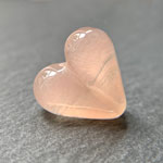
Rosaline Pink is a cloudy transparent.
-
Testers were divided on whether or not they liked the cloudy transparents.
"I like the cloudy transparents. Lots!" – Carol Ann Savage
"I didn't get on with the cloudy transparents. If you can add more pigment and they are not shocky, I think they would be good." – Suzy Hannabuss
"I found the cloudy transparent glass to be much stiffer than other glass so it was a bit hard to sculpt with." – Lori Peterson
"I had rods of cloudy transparent colors that were light as well as rods that were very dark. I made some beads with the dark rod of Watermelon and very little light came through the glass and the color was unappealing to me. However, the dark rod of Chocolate is a very nice brown. With such a huge difference between rods, I think it’s kind of a confusing sale if dark and light rods are presented as the same color." – Gloria Sevey
-
Many testers reported that our cloudy transparents were prone to shockiness or breakage. **Please pre-warm / pre-anneal rods accordingly.**
"In general, I have found the Cloudy Transparent colours to be a bit shocky. For the most part, this was quite manageable and well worth the effort, at least for the colours I've tried so far." Read more at Melanie's blog. – Melanie Graham
"I experienced neither shockiness nor boiling with the cloudy transparents. I did use a cool flame though. I’ve changed my method of introducing glass rods to the flame which reduces shocking considerably [almost non-existent unless there are holes in the rod]. I rotate the tip of my rod way above the flame for a short time and then slowly rotate it downward into the flame. It’s usually starting to melt by that time. That said, not everyone uses this cautious of a method and might have rods being shocky because of being put into the flame when they’re still cold." – Gloria Sevey
"In the new cloudy colors it does seem the thicker the rod the more saturated the color seems to be. I had zero issue with Heather, Morgan and Watermelon. However my beloved Pink Lemonade and Vintage Rose were super shocky even with kiln warming." – Michelle Veizaga
"Heather is a little shocky so a little pre-warming and careful introduction to the flame is all that’s needed. I’ve not had a lot of luck as Heather layered over Effetre White cracked [probably thermal] and when I tried over CiM Peace I got all sorts of crazy cracks. I found Chocolate a bit shocky, certainly more so than Watermelon which surprised me since they are both cloudy transparents and made in the same way. However pre-warming the rod seemed to help and the shocky-ness certainly wouldn’t put me off." – Heather Johnson
"I agree with the mostly-too-shocky." – Dwyn Tomlinson
"I made a clear base and encased with the cloudy transparents, but sadly the beads cracked." – Trudi Doherty
"I experienced micro cracks when combining several of the cloudy transparents with 96 COE frit." – Darlene Collette
"I didn’t have any problems with the cloudy transparents! They weren’t shocky or boiled, but I have to admit, that I work in a cold flame and very carefully to prevent any bad incident." – Claudia Eidenbenz
"I found them intolerably shocky." – Laurie Nessel
"I preheated all the testing rods in a Devardi rod warmer as it was particularly cold in the UK at that time and this is something I always do that time of year. By doing this I didn't experience any shockiness. I also used a very thin encasement of Effetre Superclear 006 before applying cloudy transparents as an encasement - no issues." – Juliette Mullett
"I found the cloudy transparents shocky, that they boiled easily in the flame which created micro bubbles on the surface of beads, and that under clear encasement some of them cracked." – Jolene Wolfe
-
Some testers reported that our cloudy transparents were prone to boiling.
"I did find some cloudy transparents could boil if you worked them too hot. I like to work them cooler and with not too much oxygen in the flame." – Trudi Doherty
"I had no issues with any of the cloudy transparents apart from a little bubbling in 1 or 2 of them." – Juliette Mullett
"Another thing common to all of these colours [so far] is that they can be easy to boil, so you really have to watch your heat. This is true not only with fine stringer, but also when applying the glass from the rod to your bead. Work higher up in the flame and a bit cooler to avoid this problem." Read more at Melanie's blog. – Melanie Graham
-
Testers were divided on whether or not they liked the wispy or streaky quality of the cloudy transparents.
"All but two of the new color strands sold and the two that didn’t sell didn’t get much attention [Chocolate and Heather, both cloudy transparents]. I think that maybe those cloudy transparents just didn’t have enough zing to capture the mood hopes of this moment in time." – Gloria Sevey
"There are lots of straight transparents. I'd vote for more cloudy transparents. If the glass is wispy then you can use those qualities to your advantage when making beads." – Carol Ann Savage
"I loved the wispy/streaky quality, for me that was a big part of the attraction." – Trudi Doherty
"I think the wispy/streaky quality is great for certain designs, but it's not something I prefer." – Laurie Nessel
"I quite like the wispy quality, but I do like the more saturated streaks." – Heather Johnson
"Some of my studio mates were unhappy with the color saturation in the cloudy transparents, particularly when making blown beads." – Janet Evans
"I thought the wispiness was an upside. We have lots of solid colours and very few wispy ones. My opinion is that the wispiness is a plus and fills a gap." – Melanie Graham
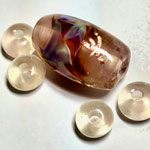
"Rosaline Pink is a pale cloudy pink transparent that was very shocky to melt. Double Helix's Kalypso silver glass was added to create wispy flame like waves within this focal bead with a few copper dragonfly encased in clear Zephyr. The spacers are pure Rosaline Pink." Read more at Darlene's blog. |
|
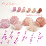
| A comparison of various pink cloudy transparents.
–
Olga Ivashina
|
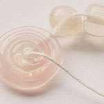
"Rosaline Pink is the palest of pinks. It’s lightly peached and is gorgeously translucent."
– Gloria Sevey
|
|
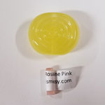
| "I did have a couple odd reactions with a few of the new colors- apparently they didn't like the 1050 garage temp of my kiln and the color went whackadoodle!"
–
Joy Munshower
|
"Rosaline Pink is another cloudy transparent and it's quite similar to Morgan, although it lacks Morgan's slight subtle shimmer. Rosaline Pink does have a slight yellowness to it, though. This one was a tad shocky but only mildly so; the rod did that fracturing thing as opposed to the full pop-and-send-hot-bits-flying thing. Apart from that, it was fine to melt." Read more at Laura's blog. |
|