CiM Tester Feedback
-
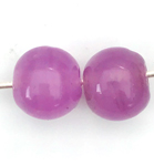
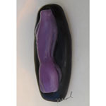
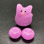
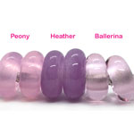
Heather is a cloudy transparent.
"Heather is a lovely colour. I don’t think I’ve got any other pink/purple glass that’s close to it. It’s almost halfway between CiM Crocus and CiM Rose Quartz." – Heather Johnson
-
Some testers found it difficult to maintain Heather's pinkness.
"I seem to remember someone else had Heather go grey and the colour came back in the kiln as well, the same as I did. I didn't think it was a problem, just a working property of the glass, a bit like yellows go red and reds go black until they cool again." – Heather Johnson
"I got grey when heating at first, but then I treated this colour like I do striking colours, so I gave it plenty of reheats, slightly cool, reheat, etc. This removed the grey. The end result once annealed was the same colour as the rod [gorgeous!]" – Juliette Mullett
"I was able to achieve the colour in the rod form but took a different approach to normal. Instead of melting a pea sized gather and applying on the mandrel I applied the glass to the mandrel in small increments, like layering. By using this technique I was able to build the colour up to the hue percentage I wanted. More time consuming than usual but achieved some lovely results and the beads I made using the cloudy transparent sold straight away." – Juliette Mullett
-
Testers were divided on whether or not they liked the cloudy transparents.
"I like the cloudy transparents. Lots!" – Carol Ann Savage
"I didn't get on with the cloudy transparents. If you can add more pigment and they are not shocky, I think they would be good." – Suzy Hannabuss
"I found the cloudy transparent glass to be much stiffer than other glass so it was a bit hard to sculpt with." – Lori Peterson
"I had rods of cloudy transparent colors that were light as well as rods that were very dark. I made some beads with the dark rod of Watermelon and very little light came through the glass and the color was unappealing to me. However, the dark rod of Chocolate is a very nice brown. With such a huge difference between rods, I think it’s kind of a confusing sale if dark and light rods are presented as the same color." – Gloria Sevey
-
Many testers reported that our cloudy transparents were prone to shockiness or breakage. **Please pre-warm / pre-anneal rods accordingly.**
"In general, I have found the Cloudy Transparent colours to be a bit shocky. For the most part, this was quite manageable and well worth the effort, at least for the colours I've tried so far." Read more at Melanie's blog. – Melanie Graham
"I experienced neither shockiness nor boiling with the cloudy transparents. I did use a cool flame though. I’ve changed my method of introducing glass rods to the flame which reduces shocking considerably [almost non-existent unless there are holes in the rod]. I rotate the tip of my rod way above the flame for a short time and then slowly rotate it downward into the flame. It’s usually starting to melt by that time. That said, not everyone uses this cautious of a method and might have rods being shocky because of being put into the flame when they’re still cold." – Gloria Sevey
"In the new cloudy colors it does seem the thicker the rod the more saturated the color seems to be. I had zero issue with Heather, Morgan and Watermelon. However my beloved Pink Lemonade and Vintage Rose were super shocky even with kiln warming." – Michelle Veizaga
"Heather is a little shocky so a little pre-warming and careful introduction to the flame is all that’s needed. I’ve not had a lot of luck as Heather layered over Effetre White cracked [probably thermal] and when I tried over CiM Peace I got all sorts of crazy cracks. I found Chocolate a bit shocky, certainly more so than Watermelon which surprised me since they are both cloudy transparents and made in the same way. However pre-warming the rod seemed to help and the shocky-ness certainly wouldn’t put me off." – Heather Johnson
"I agree with the mostly-too-shocky." – Dwyn Tomlinson
"I made a clear base and encased with the cloudy transparents, but sadly the beads cracked." – Trudi Doherty
"I experienced micro cracks when combining several of the cloudy transparents with 96 COE frit." – Darlene Collette
"I didn’t have any problems with the cloudy transparents! They weren’t shocky or boiled, but I have to admit, that I work in a cold flame and very carefully to prevent any bad incident." – Claudia Eidenbenz
"I found them intolerably shocky." – Laurie Nessel
"I preheated all the testing rods in a Devardi rod warmer as it was particularly cold in the UK at that time and this is something I always do that time of year. By doing this I didn't experience any shockiness. I also used a very thin encasement of Effetre Superclear 006 before applying cloudy transparents as an encasement - no issues." – Juliette Mullett
"I found the cloudy transparents shocky, that they boiled easily in the flame which created micro bubbles on the surface of beads, and that under clear encasement some of them cracked." – Jolene Wolfe
-
Some testers reported that our cloudy transparents were prone to boiling.
"I did find some cloudy transparents could boil if you worked them too hot. I like to work them cooler and with not too much oxygen in the flame." – Trudi Doherty
"I had no issues with any of the cloudy transparents apart from a little bubbling in 1 or 2 of them." – Juliette Mullett
"Another thing common to all of these colours [so far] is that they can be easy to boil, so you really have to watch your heat. This is true not only with fine stringer, but also when applying the glass from the rod to your bead. Work higher up in the flame and a bit cooler to avoid this problem." Read more at Melanie's blog. – Melanie Graham
-
Testers were divided on whether or not they liked the wispy or streaky quality of the cloudy transparents.
"All but two of the new color strands sold and the two that didn’t sell didn’t get much attention [Chocolate and Heather, both cloudy transparents]. I think that maybe those cloudy transparents just didn’t have enough zing to capture the mood hopes of this moment in time." – Gloria Sevey
"There are lots of straight transparents. I'd vote for more cloudy transparents. If the glass is wispy then you can use those qualities to your advantage when making beads." – Carol Ann Savage
"I loved the wispy/streaky quality, for me that was a big part of the attraction." – Trudi Doherty
"I think the wispy/streaky quality is great for certain designs, but it's not something I prefer." – Laurie Nessel
"I quite like the wispy quality, but I do like the more saturated streaks." – Heather Johnson
"Some of my studio mates were unhappy with the color saturation in the cloudy transparents, particularly when making blown beads." – Janet Evans
"I thought the wispiness was an upside. We have lots of solid colours and very few wispy ones. My opinion is that the wispiness is a plus and fills a gap." – Melanie Graham
-
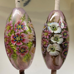
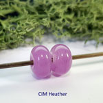
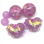
Special thanks to Heather Johnson for providing the photo in this section.
"I love this glass. In my opinion, it’s just as lovely as Effetre’s Evil Purple, but without the evil. It’s easy to work with on so many levels. It was not shocky poppy- didn't devitrify and didn't burn up.”
– Susan Parry
|
|
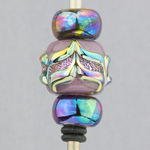
| “This shows a comparison of the shades Heather can create. When pink dichro is applied to the surface, it not only glows, but appears lighter. When made into solid beads, the color is more intense. The heart with turquoise dots appears even more intense because I kept it in the flame longer. This color appears to deepen with more heat exposure.”
–
Susan Parry
|
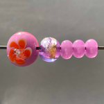
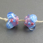
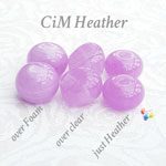
Left to right: Dollhouse Milky & Heather. Inside lighting.
– Carol Ann Savage
|
|
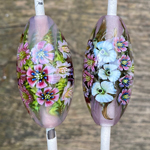
| Left to right: Dollhouse Milky and Heather. Outdoor lighting.
–
Carol Ann Savage
|
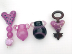
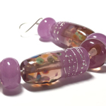
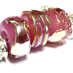
"Heather is a luscious pinky mauve. Shown here as spacers, as a base for silver foil, and encasing white [with embellishments]. I had no issues with shockiness."
– Janet Evans
|
|
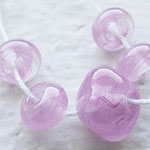
| “I found Heather to be slightly shocky but easily dealt with by warming it slightly before use. The color is a gorgeous rich translucent purple. I love how it maintains its vibrancy! [Made on a Hot Head torch.]”
–
Alexis Berger
|
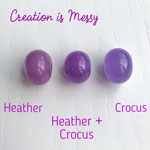
"In 2020 CiM introduced a cloudy transparent named Heather. It was extremely well received by the glass community as a unique offering of a pinkish purple. Glass testers loved the color but found it to be a bit temperamental and shocky in the melting process. . . . I am pleased to say in my testing that the new 2021 version of Heather is absolutely lovely to work with." [Here paired with Yours Truly and Glass Diversions Persian Paisley glass frit.] Read more at Darlene’s blog. |
|
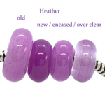
| "The new batch of Heather was so much nicer to work with than the first batch. Didn’t shock at all. The rod I used is much darker that the first batch. A lovely colour."
–
Suzy Hannabuss
|
"I received two different batches in 2021 and I like both of them even more than 2020 Heather. They are both less saturated than my rod from 2020 and I really like both versions. One is closest to 2020 Heather but is much easier to sculpt yet still retains that pinky-purple color. The other is a bit less intense in color but gains an ethereal quality I really loved. Either is a winner in my book. Both were very mildly shocky, nothing too bothersome. And I experienced only slight tendency toward fizzing. To eliminate it completely, I just backed away from the torch face a bit as I pulled the rod away from the bead."
– Lori Peterson
|
|
| "Heather is a lovely purple with a pink undertone. Not shocky and no issues with bubbling or scumming. Played nicely with dichroic and silver glass on surface. I compared two different Heather batches and one lost its brightness after working it in the flame, while the other did not."
–
Terri Herron
|
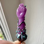
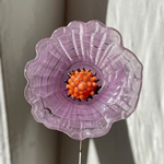
"Heather has a lovely stickiness to it that is very seductive. I would say it looks like the color of an orchid. I worked it very thin to make this flower and its saturation was a bit diminished but that was what I was going for. I think if you wanted to maintain its saturation, it would be a great color to work with in a thicker more sculptural piece. I had no trouble with shockiness or scumming. I worked in a very cool flame [on a Hot Head] which I think helped preserve Heather's color."
– Alexis Berger
|
|
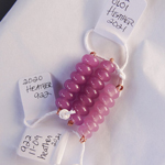
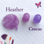
| "I mixed two colors Crocus and Heather and got a wonderful color."
–
Olga Ivashina
|
"064 black base with a Heather torso- scuzzes, be gentle, shows veiled look- streaky."
– Laurie Nessel
|
|
| "In general, I have found the Cloudy Transparent colours [including Heather] to be a bit shocky. For the most part, this was quite manageable and well worth the effort, at least for the colours I've tried so far. Heather is the one that I've had the most trouble with out of this group. Another thing common to all of these colours [so far] is that they can be easy to boil, so you really have to watch your heat. This is true not only with fine stringer, but also when applying the glass from the rod to your bead. Work higher up in the flame and a bit cooler to avoid this problem. I have not specifically tested any of these for colour reactions yet. When I do, I might find out something interesting, but so far they do not seem very reactive with other colours." Read more at Melanie's blog. |
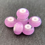
"Heather is a cloudy transparent magenta - a true purply-pink. In this set, it worked beautifully with Double Helix Helios silver glass. It melted smoothly with no adverse reaction other than a slight golden hue." Read more at Darlene's blog. |
|
| "Heather is a unique, lovely, cloudy, swirly transparent that has a gorgeous delicate hue of pale pinkish magenta."
–
Gloria Sevey
|
"Heather is another gorgeous color created by suspending opaque pigment in transparent glass. Sculpts fairly well, a bit stiffer than translucents I’ve been working with. That color, tho…**love**."
– Lori Peterson
|
|
| "A lovely, lovely color. Rods that have been in the flame tend to shock the end off. Can be a bit boily. But what a color!" Read more at DragonJools blog. |
"I started with this glass by making three small beads on the same mandrel and as I was making the 3rd bead I realised the other two had gone a very washed out grey. I really thought I had burnt the gorgeous colour out so sadly put these beads in the kiln expecting 3 wasted beads. However I was so pleasantly surprised when I opened the kiln the next morning and the colour had come back! I worked slightly cooler for future beads but the grey still appeared when hot and the pink came back when cool. So fear not if your Heather beads go a bit grey while you’re working!"
– Heather Johnson
|
|
| "This is such a unique and delicate colour, kind of streaky in appearance but when swirled and swirled it gives an incredible appearance, reminiscent of spun silk. The more you apply the darker the hue will get. Such a gorgeous colour."
–
Juliette Mullett
|
"Heather is another cloudy/streaky transparent. It is a beautiful colour and the closest colour would be Crocus. I find that it does cause bubbling when encased."
– Suzy Hannabuss
|
|
| "CiM describe Heather as ‘a cloudy transparent magenta’ and I’d say that’s accurate. It’s like a pinker form of Crocus but instead of being a solid colour it’s a mix of clear and translucent purply-pink. A lot of these new CiM colours are this cloudy glass and it’s really nice. You get a kind of wispy, ethereal effect which is ever so pretty. Heather melts smoothly with no shocking or bubbling. It’s a nice middle-of-the-road consistency too." Read more at Laura's blog. |
"Heather is very shocky. I spent half a rod and can’t create any bead. I have two rods of this color and therefore left one in my kiln all night. My experiment was positive. After spending overnight in the kiln, my rod became softer without any shockiness."
– Olga Ivashina
|
|
| "Heather is another of CiM's new experimental cloudy transparents in a glorious shade of lilac. So pretty! As with Watermelon, the areas where I have added additional glass between presses are very apparent." Read more at Kitzbitz Art Glass' blog. |
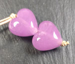
"Heather is a really pretty colour. It reminds me of Crocus but more pink and far less of a blue tone to it. It melts nicely. I did find I got a tiny bit of bubbling just on the very tip of the rod as I was making the hearts, I didn't notice it while I was making the bigger rounds. Not sure if I was over heating it a bit or letting it cool and then heating it again...it was only a little so I'm sure with more familiarity with the glass it could be avoided. The rounds have been decorated with Glass Diversions Lemongrass frit and roses of Cranberry Pink over white. The little hearts have gold foil, roses and raised dots of the new pale pink Ballerina."
– Josephine Wadman
|
|
| "Lush, just lush. Heather is one of the cloud power or cloudy colours, made with clear and colour pigments [not to be confused with veiled cane]. This new style of glass provides a whispy effect in beads. When it's made purely with Heather, the bead will look more solid, but when you use it to encase over white or clear the special effect is more evident. It's a gorgeous bright, light pink with some blue tones."
–
Trudi Doherty
|