Messy Color™ Safari Ltd Run
511726 -
|
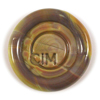
A yellow-toned opaque brown.
|
|
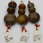
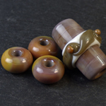
"Honestly - I can't tell them apart. Maybe Van Dyke [rod and 3 pieces on the left] retains a little more grey vs Safari [rod and 3 pieces on the right]. But functionally - I can't tell them apart. Maybe they work differently in beads. They are beautiful, but they seem interchangeable to me - given their variability." Read more at DragonJools blog. – Dwyn Tomlinson Click here for other interesting Safari Ltd Run discoveries.
|
CiM Tester Feedback
-
Special thanks to Trudi Doherty for providing the photo in this section.
Join Trudi Doherty's FB group Lampwork Colour Resource Sharing Information for a catalogue of color study.
Claudia Eidenbenz’s "Vetrothek" (glass library) is a great resource for color comparisons.
See Kay Powell’s frit testing samples.
Browse Serena Thomas’ color gallery.
Check out Miriam Steger’s CiM color charts.
Consult Jolene Wolfe's glass testing resource page.
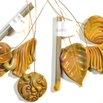
Left to right:
Toto, Canoe, Safari, Moccasin
– Claudia Eidenbenz
|
|
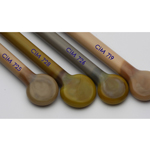
| Left to right:
Effetre 263, Canoe, Safari
–
Claudia Eidenbenz
|
"Honestly - I can't tell them apart. Maybe Van Dyke [rod and 3 pieces on the left] retains a little more grey vs Safari [rod and 3 pieces on the right]. But functionally - I can't tell them apart. Maybe they work differently in beads. They are beautiful, but they seem interchangeable to me - given their variability." Read more at DragonJools blog. |
|
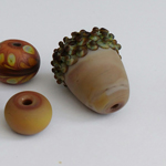
| "I tested it with a sprinkling of Glass Diversions Coffee Bean frit. This created a striated look that reminded me of a giraffe print. The spare tab bead is the true color of Safari with no frit . . .I can definitely see it's potential for animal or exotic prints." Read more at Darlene's blog. |
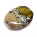
"Safari morphs from a warm brownish grey to . . . the same shades of autumn leaves." Read more at DragonJools blog. |
|
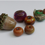
| "Safari looks greyish in the rod, and not having looked them up beforehand, I was very surprised that it immediately struck to a light sandy brown! The bead coming out of the kiln is more uniform than it looked going in, but you can still see a darker brown in one corner below." Read more at Heather's blog. |
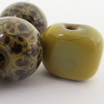
"Safari has more colour in it that the Van Dyke, with a more yellow tone. On working a long time with a lot of heating, cooling and reheating it tended to lose a lot of the variations of colour in it. However when worked quickly, cooled and then spot heated it really sang with a wide variety of colour. The base of the focal and the dots are in Safari and it was reheated and shaped a lot. However the spacer beads were just simply made, cooled and spot heated and you can see the colours pop completely! Overall, Safari is a great colour that is easy to work with."
– Claire Morris
|
|
| "It looks fantastic etched- bringing out the different shades."
–
Sandy Fulbrook
|
"Safari had a yellow core in the rod which I hoped would yield some interesting variations in colour and I wasn't disappointed. It behaved well with no spitting; it seems the longer it is worked the paler it becomes. It is a good base for Ekho."
– Sandy Fulbrook
|
|
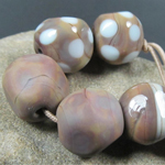
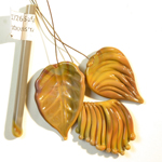
| "It's a pretty brown that gives several shades within the same bead ranging from french mustard to warm chocolate brown. The darkest areas show where I have formed facets by pressing the hot glass with a graphite paddle." Read more at Kitzbitz Art Glass' blog. |
"Introduce the molten glass to a cold tool or bead roller and a rich honey-blonde color blooms on the surface."
– Heather Sellers
|
|