Messy Color™ Daffodil Ltd Run
511207 -
|
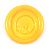
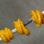
An opaque orange.
|
|
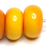
”Daffodil and Alley Cat both strike a little, even in spacer-sized beads so you can see some variation across the surface.” Read more at Heather’s blog. – Heather Kelly Click here for other interesting Daffodil Ltd Run discoveries.
|
CiM Tester Feedback
-
Daffodil is an opaque orange.
"I especially like that it’s super cheerful and it’s not streaky." – Gloria Sevey
-
Special thanks to Genea Crivello-Knable & Heather Sellers for providing the photos in this section.
Join Trudi Doherty's FB group Lampwork Colour Resource Sharing Information for a catalogue of color study.
Claudia Eidenbenz’s "Vetrothek" (glass library) is a great resource for color comparisons.
See Kay Powell’s frit testing samples.
Browse Serena Thomas’ color gallery.
Check out Miriam Steger’s CiM color charts.
Consult Jolene Wolfe's glass testing resource page.
"I find the Effetre yellows to be either vile-looking or not opaque enough but Daffodil is just beautiful. It's a deep, vibrant yellow and again, it works perfectly as stringer and I had no encasing issues. That's right, a yellow that you can encase." Read more at Laura's blog. |
|

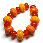
| ”Daffodil and Alley Cat both strike a little, even in spacer-sized beads so you can see some variation across the surface.” Read more at Heather’s blog. |
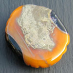
"Daffodil reacts strongly with silver leaf leaving a finish that looks something like an antique mirror finish before it was etched." Read more at Kitzbitz Art Glass's blog. |
|
| "This is the classic 'schoolbus' colour - it looks yellow - until you put it next to something yellow - in which case - it is obviously orange. Then you put it next to something orange, and it is, of course, obviously yellow." Read more at DragonJools blog. |